®
® 


 ®
® 






For a website to be effective, it needs to be designed in a way that makes sense for the user. This can be done by following a few basic principles of good design. Read our article and start designing creative websites.
Choose a theme
Now that you’ve considered the general topics for your site, it’s time to choose one. A good theme should be interesting to you and relevant to your business. It should also be relevant to your target audience, meaning there’s a good chance they’ll be interested in the topic as well.
For example, if you’re creating a site for a yoga studio and want visitors to learn more about their class schedule, then “Yoga Class Schedule” would make sense as a page title because it describes what people will find on that page (a list of upcoming classes). On the other hand, if the same yoga studio had already created an entire blog dedicated to new ways people can practice yoga at home (e.g., using props), they might not want to use “Yoodledo” as a page title because that already sounds like something completely different!
Avoid being generic
If you’ve ever used a template to build a creative website, you may have noticed it can be hard to tell what’s original and what’s not. The reason is that templates are based on elements from other sites, which means they often look very similar. However, if you want your site to stand out from the crowd and make an impression, avoid copying overused elements like stock photos or fonts. Instead, use these elements sparingly or in unique ways to design a creative website.
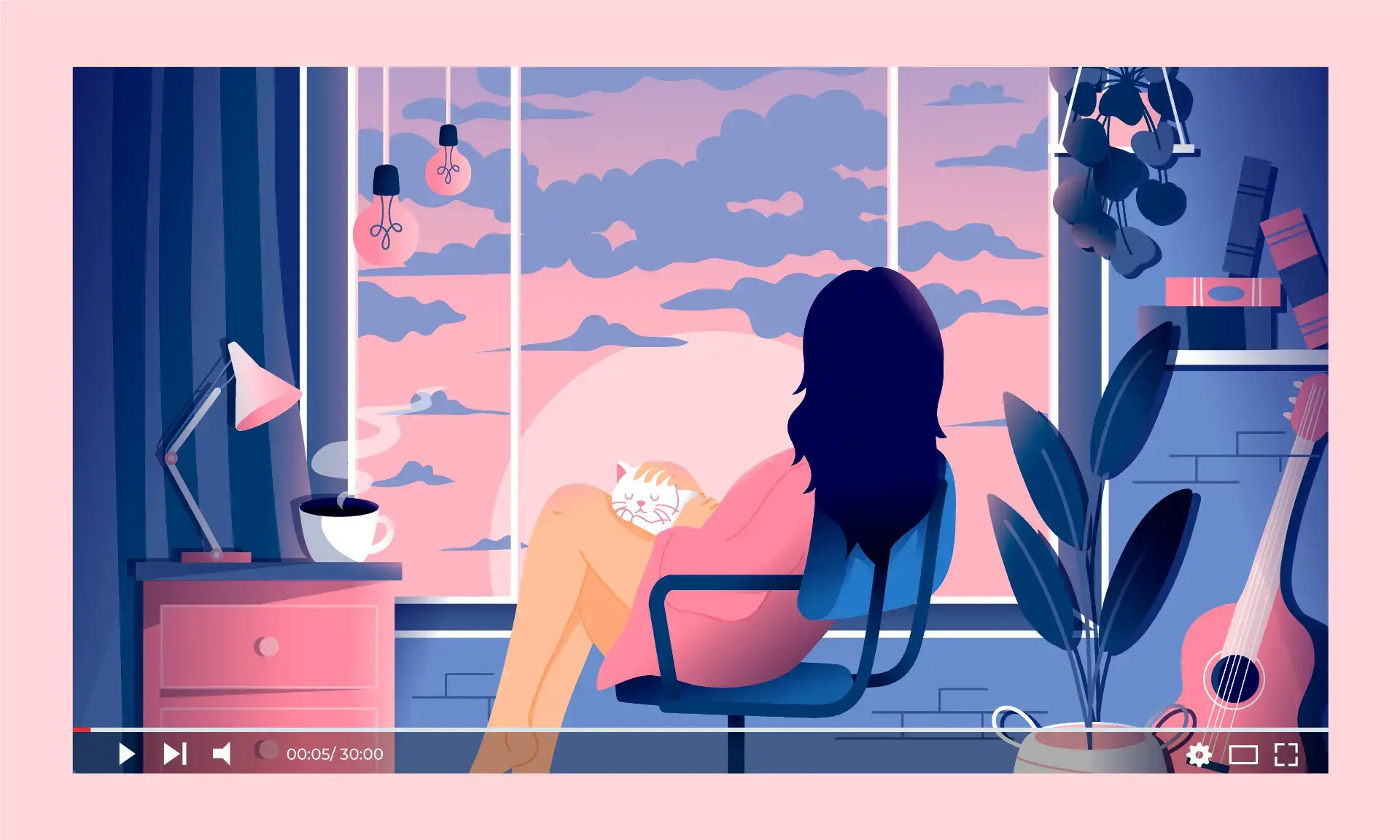
Use illustrations to create custom visuals
This is a great way to illustrate concepts, tell a story, or break up text. Illustrations can help you create a memorable experience for your users and help them better understand information by providing visual cues on how to interpret it.
It’s important that the illustrations you use are related to the message (or emotions) you want your audience to take away from the content. For example, if you’re writing an article about how to make coffee at home, finding photos of different coffee mugs on Pinterest or elsewhere online might not be very helpful because there’s nothing connecting those images directly to what you’re trying to convey in your article. Instead, think about using illustrations specifically related to brewing coffee at home — like measuring spoons or different types of filters — so your audience associates those images with their own home-brewing experiences!
Be consistent and clear in your design
Your site’s design needs to be consistent and clear. You want people to easily find what they’re looking for, and you want them to be able to navigate the site quickly and easily.
Make sure you clearly communicate what you offer on your site. If it’s a service business or if there’s something unique about your product that sets you apart from others in your industry, make sure it’s clear on the homepage or somewhere else prominent on the site so visitors know right away what differentiates you from others.
Keep navigation simple
Keep navigation simple and make it easy for users to find their way around your site.
This can be done by maintaining consistent navigation throughout the site, using cookies to help users find their way back to the homepage, and using a consistent menu bar throughout the site. You can also use a consistent design for links, such as underlined text.
People will have a better experience interacting with your site if you do these things
By keeping these principles in mind, you’re well on your way to designing a website that improves the user experience.
Summary
The more you can learn about the people who use your site, the better. What are their goals? What things do they want to see when they visit? What kind of content do you have that will help them achieve those goals? Finally, the site should be clear and consistent in its design so visitors know what to expect when they arrive.