®
® 


 ®
® 


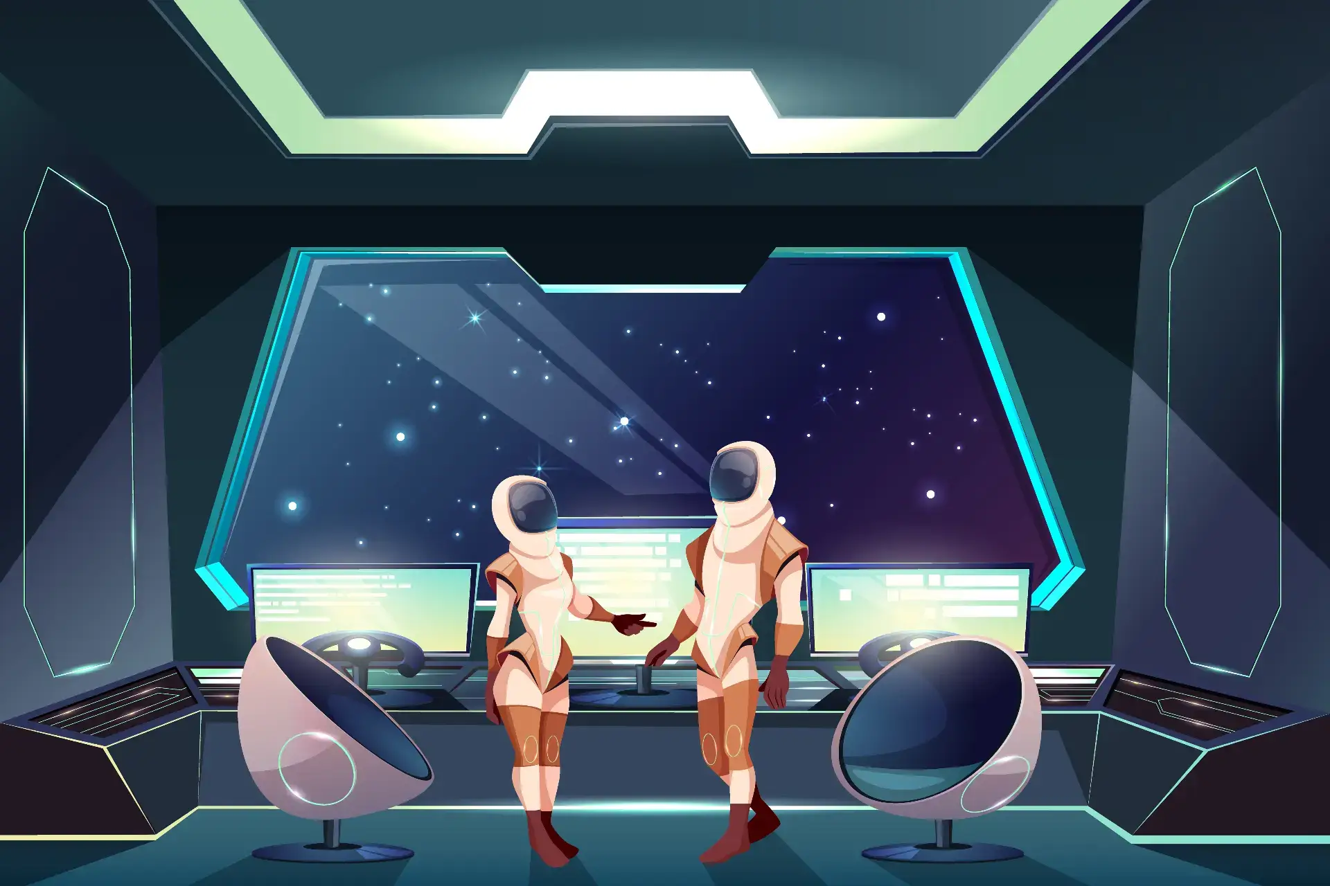



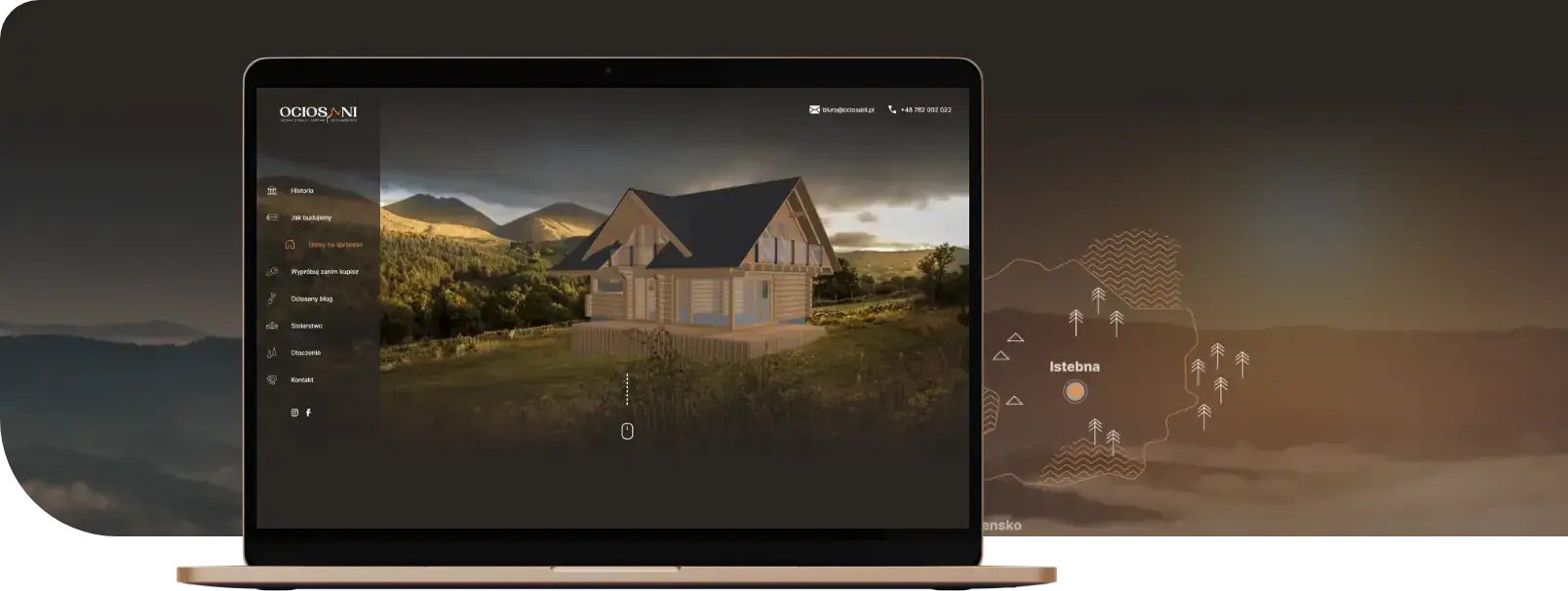
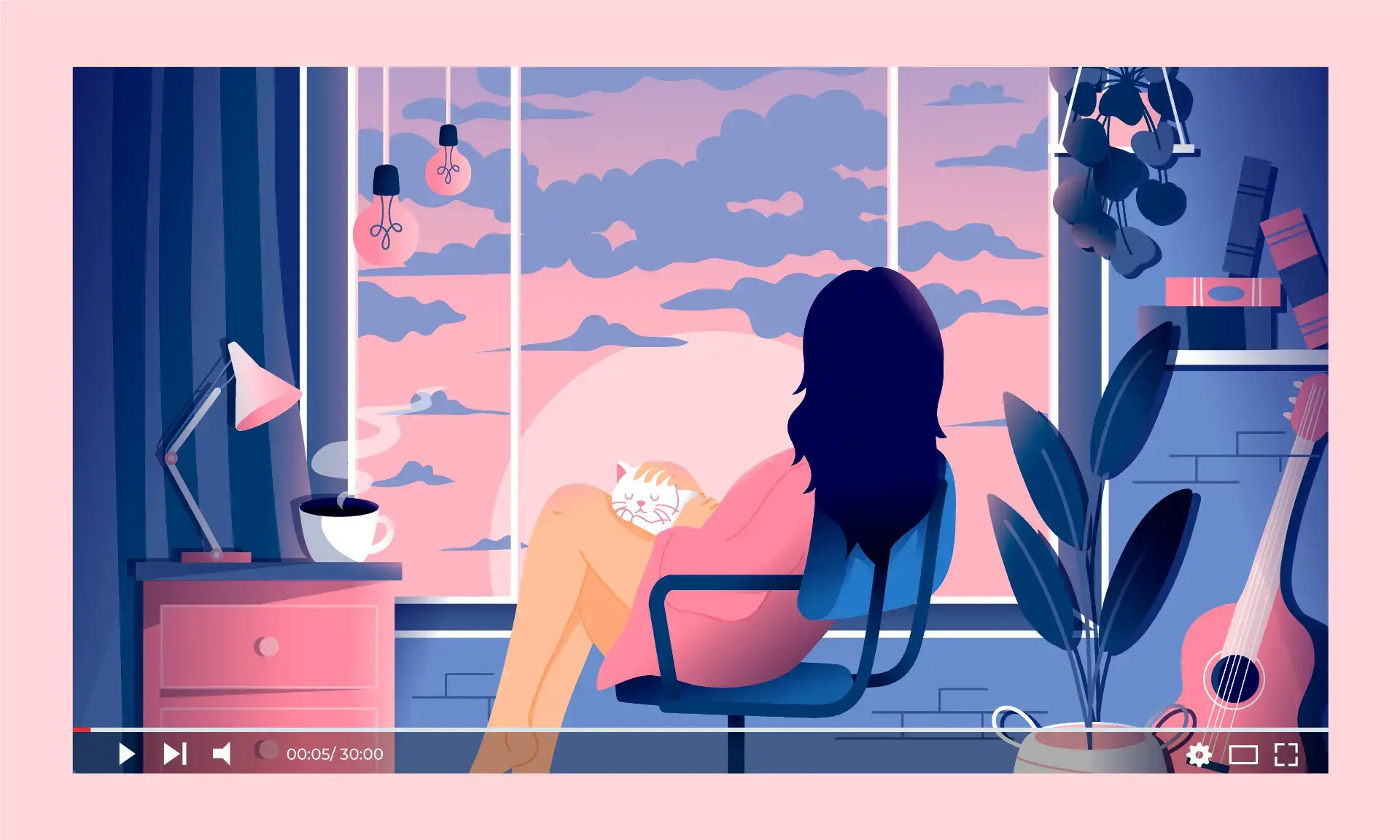
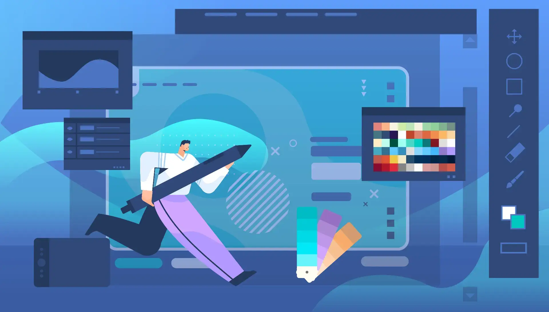
We all know websites from the past that consisted of a few words, maybe an image or two, and perhaps a bit of color. Today’s websites are much more interactive, with many different elements that move around and create an immersive experience for the user.
More interactive websites
User experience is key. It is more important than ever before. Websites need to be engaging, responsive, and mobile-friendly.
Minimalism
Minimalism is a design trend that began in the early 2000s and has grown in popularity over time. It involves removing unnecessary elements from a design, focusing on what is essential, and reducing noise.
As you can see in the example of a minimalist website below, there are no distracting animations or fancy transitions. Instead, all the emphasis is on one message: “Learn to code.” As you scroll down the page, you will notice that the information gets increasingly dense until reaching the fourth state where text fills every pixel on the screen (this may not be ideal for people with poor vision).
Minimalism can be used to create effective designs because it allows users to focus on what is most important – whether it is information-rich content like an article or tutorial video, or simply providing enough visual cues so users know how their actions will affect the environment (e.g., buttons). The key here is finding a balance between minimalism and usability by making sure there are not too many distracting elements while also ensuring users feel comfortable exploring the site/app without feeling overwhelmed by clutter.
Typography
- Font size: The most important element in typography is font size! If you want your site to stand out, you need to make sure it is readable and easy to read. Do not just make it big for the sake of making it big; there needs to be a reason why you increased or decreased the size of each word/sentence/link/image etc.
For example, if someone has poor vision, increasing the font size will help them see better on the page and thus interact with it more effectively! Similarly, if someone wants their content to be printed (for example, a blog article), having a larger font will make this task easier for them because they do not have to squint at small text as much when reading from paper compared to computer screens where everything is usually around 12pts-18pts depending on screen resolution.
Accent colors
Accent colors are used to add visual interest and draw attention to important elements. They can also be used to add hierarchy and personality, and even just a sense of fun!
The first thing you need to know about accent colors is that they do not have to be bright or bold; it is always best to use one that fits the dominant color scheme in your design. For example, if you are going with a warm color theme like orange and white on top of an off-white background, then the accent color could be red – it will complement the orange nicely while still being understated enough not to overpower it.
Overlapping elements
You are probably familiar with overlapping elements. You have seen them in every design tutorial you have ever read, and they are a great way to add depth to your website.
What do we mean by “overlapping elements”? It is when two or more elements overlap each other, creating a sense of depth. This can be done through images, text, and more.
Overlapping elements can also be used not just to add dimension to your designs – they can also create movement and life!
Organic shapes
When designing a website, consider using organic shapes to represent content. Organic shapes are those you can actually draw by hand without any tools or templates. Text with an organic shape, like this, is great for creating headers that stand out on the page:
- Using a combination of organic and geometric shapes will create an interesting layout. For example, if you have a photo with straight lines, use rounded corners on the surrounding text so the piece does not look too “boxy.”
The future is here…
- The future is here.
- Websites are becoming more interactive rather than static.
- Minimalism is the future; it is all about typography and accent colors these days!
- Overlapping elements are the most exciting thing in web design right now; they create a sense of depth that draws users into your site and makes them want to explore more.
If you want your site to stand out from the crowd, you need to keep up with the trends that are emerging – but also remember that trends change quickly and there will always be something new coming soon!
Summary
I believe in the future of modern websites. The trends we see today will continue to evolve as new technologies and techniques emerge, but what is clear is that designers are pushing their boundaries to create new, exciting experiences for their users.